
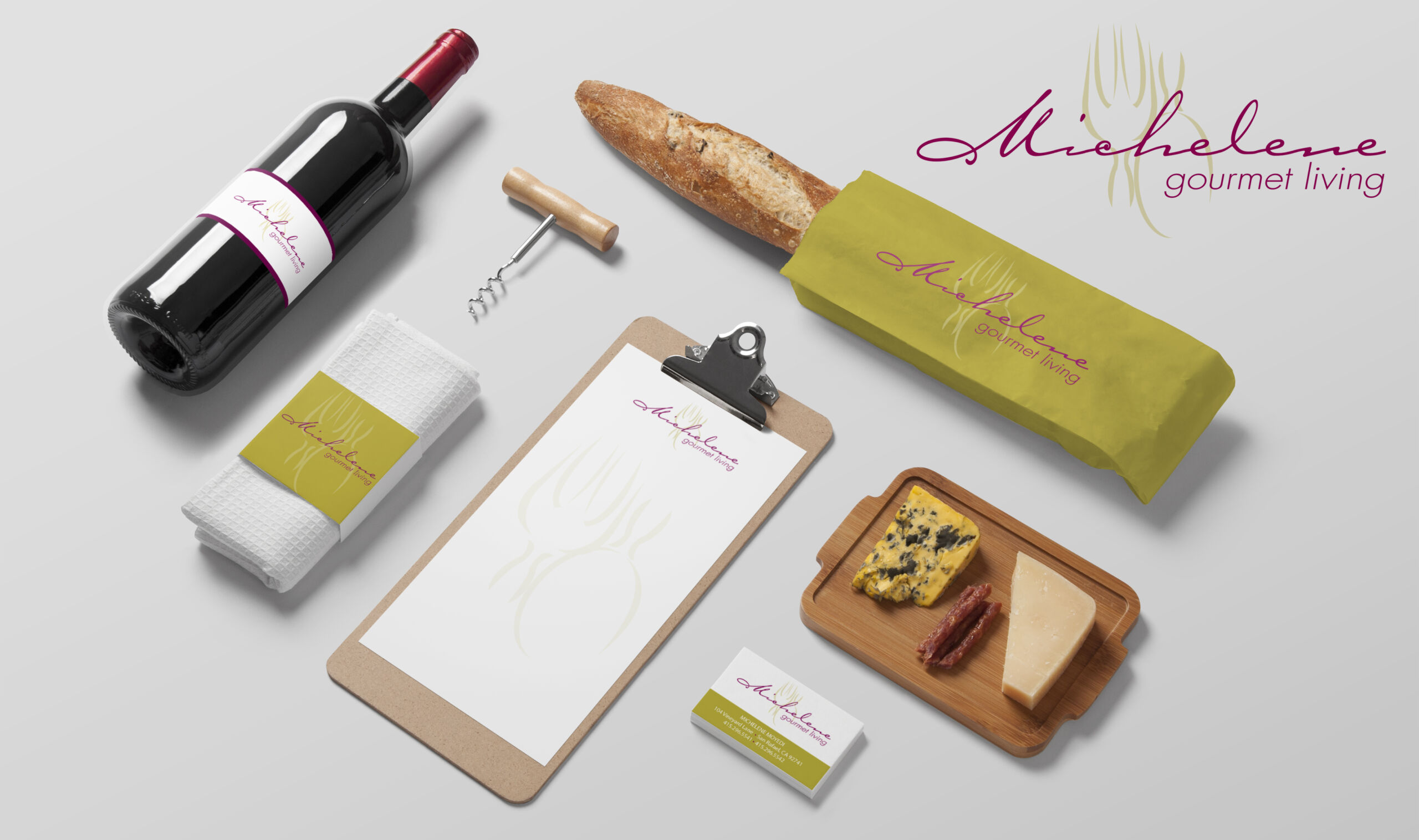
You like your logo.
The colors work. The typography feels right. It represents your organization well.
So why does your brand still feel a little… off?
It may not be your logo at all.
One of the biggest misconceptions I see is that a strong logo automatically creates a strong brand. A logo is important, but it’s only one piece of a much bigger visual picture.
Your brand is what happens after the logo is designed.
Look at Everything Around Your Logo
Think about the last few pieces your organization created.
Your website. A brochure. A social media graphic. An email campaign. An event invitation. An annual report. A presentation.
If you covered up the logo, would someone still know they all came from the same organization?
That’s a simple question, but it can reveal a lot.
A strong brand has a visual language that carries through everything you produce. Your colors, typography, photography, illustration, layout, messaging and even the amount of white space you use all contribute to how your organization is perceived.
How Brands Slowly Become Inconsistent
Most organizations don’t wake up one morning and decide to abandon their brand standards.
It happens gradually.
Someone creates a quick graphic in Canva.
Another person puts together a PowerPoint.
An outside vendor designs an event piece.
A staff member finds a font they like.
A new color gets added because it “looks close enough.”
None of these decisions seems significant on its own. But over time, the brand starts drifting.
Suddenly your website looks one way, your social media looks another, and your printed materials feel like they belong to a completely different organization.
The logo hasn’t changed.
Everything around it has.
Consistency Doesn’t Mean Everything Has to Look the Same
This is an important distinction.
Brand consistency isn’t about making every piece identical.
Your annual report shouldn’t look exactly like your gala invitation. Your social media graphics don’t need to look exactly like your membership brochure.
They have different purposes and different audiences.
But they should feel related.
Think of it like members of the same family. Each can have its own personality while still clearly belonging together.
That’s where thoughtful design comes in.
Why It Matters
Consistency builds recognition.
And recognition builds trust.
When someone encounters your organization in different places, they should have a similar visual experience each time. Over time, those consistent details begin to become recognizable even before someone sees your logo.
That is when your visual identity starts doing some of the heavy lifting for you.
Most businesses and organizations produce a wide range of communications throughout the year: marketing materials, event collateral, newsletters, reports, presentations, social media and digital communications.
Without a cohesive visual system, the brand can quickly become fragmented.
And when everything looks like it came from a different place, even a great logo can’t hold the brand together.
Before You Redesign Your Logo…
Take a look at the bigger picture.
You may not need a new logo.
You may simply need stronger brand standards, a more cohesive visual system, or someone overseeing how your brand is being applied across different materials.
Sometimes the problem isn’t the identity.
It’s the inconsistency.
And fixing that can make an established brand feel fresh again without starting over.
So here’s a quick test: Cover the logo on a few of your recent marketing pieces.
Do they still look like you?
Frequently Asked Questions
What does brand consistency mean?
Brand consistency means using your colors, typography, imagery, messaging and overall design style in a recognizable way across your marketing materials. Everything doesn’t have to look identical, but it should feel like it belongs together.
How do I know if my brand is inconsistent?
Look at several of your marketing pieces side by side and cover up the logos. If they look like they could belong to completely different companies, your visual identity may need more consistency.
Do I need to redesign my logo to improve my brand?
Not necessarily. Your logo may be perfectly fine. Sometimes the better solution is to strengthen the visual system around it and create clearer guidelines for how your brand should be used.
What should brand guidelines include?
At minimum, brand guidelines should define your logo usage, color palette, typography and overall visual style. More comprehensive guidelines can also address photography, illustration, layouts, messaging and how the brand should appear across print and digital materials.