
One of the biggest misconceptions in design is that every inch of space needs to be filled.
More photos. More text. More graphics. More “just one more thing.”
But strong design is not about filling space. It is about guiding attention.
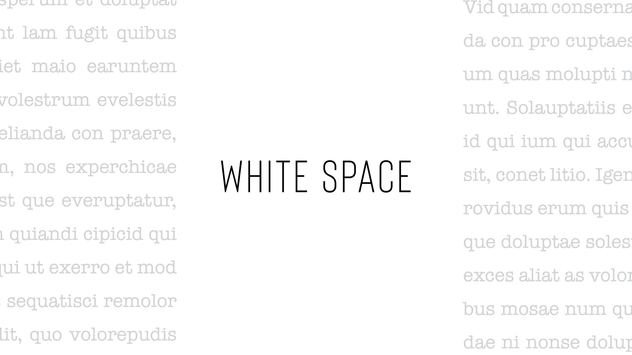
White space, sometimes called negative space, is one of the most important tools in design because it creates clarity, focus, and breathing room. It helps people understand what matters first.
When everything is crowded together, nothing stands out.
Think about the brands that feel elevated, polished, or trustworthy. They are rarely cluttered. They use spacing intentionally. Luxury brands understand this well. So do strong editorial layouts and high-end annual reports.
White space helps:
-
improve readability
-
create hierarchy
-
reduce visual stress
-
make important information stand out
-
give a design a more professional feel
Today’s audiences scan before they commit to reading. White space helps guide them through information in a way that feels approachable instead of overwhelming.
And this applies to more than print design.
Websites need white space. Social media graphics need white space. Packaging needs white space. Presentations need white space.
Even logos rely on it.
One of the hardest parts of design is knowing what not to include.
Clients sometimes worry that white space feels unfinished or that they are “not getting enough” for their investment. But often, the opposite is true. Restraint takes strategy. Good design is not about decorating every corner. It is about creating communication that feels intentional and easy to absorb.
In a world where people are overwhelmed with content every day, clarity has become a competitive advantage.
Sometimes the most powerful part of a design is the space around the message.