
An annual report is more than a requirement. It is one of the most powerful storytelling tools an organization has.
A well-designed annual report can strengthen donor relationships, demonstrate impact, build trust, and inspire future support. Unfortunately, many organizations miss that opportunity by treating their annual report as a document rather than a communication tool.
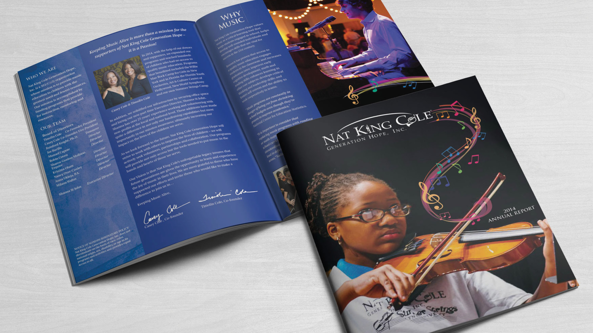
After years of designing annual reports for nonprofits and organizations of all sizes, I continue to see the same mistakes appear again and again.
Here are some of the most common, and how to avoid them.
1. Trying to Tell Everything
One of the biggest mistakes is attempting to include every program, every event, every statistic, and every accomplishment from the past year.
When everything is important, nothing stands out.
Instead, focus on the highlights. Identify the stories, achievements, and outcomes that best represent your mission and impact. Your annual report should provide a clear picture of the year, not an encyclopedia of everything that happened.
2. Too Much Text
Let’s be honest. Most readers do not sit down and read an annual report cover to cover.
People scan first. They look for headlines, photos, pull quotes, statistics, and stories.
Large blocks of text can make even the most compelling content feel overwhelming.
Break information into smaller sections, use subheads, highlight key facts, and create visual entry points that encourage readers to keep exploring.
3. Leading With Numbers Instead of Impact
Financial information matters, but numbers alone rarely create an emotional connection.
Donors, stakeholders, and supporters want to understand the difference your organization made.
Rather than simply stating how much money was raised or how many people were served, connect those numbers to real outcomes and human stories.
Data explains what happened. Stories explain why it matters.

4. Weak Visual Hierarchy
Many annual reports fail because readers don’t know where to look first.
Every page should guide the reader’s eye through the information in a logical order. Headlines should stand out. Key statistics should be easy to find. Supporting content should feel organized and intentional.
Good design helps readers understand information quickly without having to work for it
5. Losing Sight of Your Brand
Many organizations develop a unique theme or visual concept for each annual report, and that can be a great way to keep the publication fresh and engaging year after year.
The challenge is making sure the report still feels like it belongs to your organization.
Even when introducing a new theme, there should be consistency in your messaging, voice, visual style, and overall brand identity. Readers should immediately recognize who the report represents.
A successful annual report can have its own personality while still supporting the larger brand. The goal is to create something that feels both fresh and familiar.
When the theme and the brand work together, the report becomes a stronger reflection of the organization and its mission.
6. Forgetting the Donor
Many reports focus heavily on the organization and not enough on the people who make the mission possible.
An annual report is an opportunity to celebrate donors, volunteers, partners, and supporters.
Show them the impact of their investment. Help them see that they are part of the story.
7. Not Using Enough White Space
A crowded page can make valuable information harder to absorb.
White space is not wasted space. It creates breathing room, improves readability, and helps important messages stand out.
Some of the most effective annual reports use restraint rather than filling every available inch of the page.
Final Thoughts
The best annual reports do more than report information. They tell a story.
They show impact, build credibility, strengthen relationships, and remind supporters why the mission matters.
If your annual report feels overwhelming, cluttered, or difficult to read, the solution is often not more content. It is better organization, stronger storytelling, and thoughtful design.
Because a great annual report doesn’t just document the past year. It helps build support for the next one.

Frequently Asked Questions
What is the biggest mistake in an annual report?
Trying to include too much information. Strong annual reports focus on key accomplishments and impact rather than documenting everything that happened during the year.
How long should an annual report be?
The ideal length depends on the organization, but clarity and readability are more important than page count.
Why is annual report design important?
Good design improves readability, guides attention, and helps readers understand an organization’s impact more effectively.